Updating the software on your phone. Loading up your most recent save in a video game. You’ve most likely encountered a loading screen at some point in your life.
These necessary evils of modern technology are the bane of our impatient brains; constantly reminding us that we think a lot faster than even the most top of the range CPU.
As we constantly look for new ways to impress and engage site visitors’ new graphical techniques are being employed to stand out in a crowded market. The paralax effect is extremely popular, creating a feeling of depth in an otherwise flat space. Web GL is allowing incredible things to be done from a web browser. If you want to utilize all of this amazing technology for your business then you’re going to have to accept one truth: there’s going to be a loading screen.
No. One. Wants. To. Stare. At. A. Progress. Bar.
Got that? Good. You don’t want the first impression someone has of your business to be a grey bar going from left to right on the screen. If you’re a business owner and you want to pack a lot of features into your site then make sure your web designer spends the time creating a truly engaging loading experience for your site visitors (see what we did there? Not a screen, an experience.)
To start with, let’s look at some bad loading screens. Hopefully, you don’t see yourself here:
1. Cineshader

CineShader is a pretty impressive piece of technology, allowing high-quality 3D rendering in-browser. Their loading screen, however, is not so much. While some may argue that the simplicity of the loading screen contrasts the dazzling visuals that appear after we would argue it gives the impression of a Commodore 64 game (are we showing our age a little too much?)
2. Paper Planes

Now we will admit this site is BEAUTIFUL however it’s loading screen is…. Pretty average? If there’s one thing your loading screen should show it’s progression. A simple spinning logo doesn’t tell a site visitor anything and if it spins for long enough they may even think that your site isn’t working.
3. Skyline Films
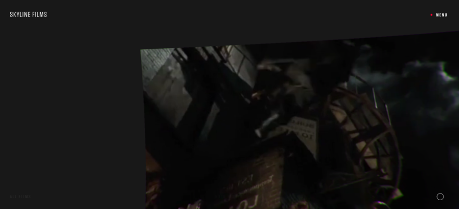
This is a good example of style over substance. This site has an amazingly interactive navigation system. Allowing the visitor to click and drag their way around a seemingly infinite set of screens showing different movies. Unfortunately, their loading screen falls victim to the common error of a loading screen doing a lot but not really saying anything. The series of dancing animations don’t give you any indication when the site will finish loading which, for us at least, was a little longer than you’d expect.
Now let’s look at some good examples so you can get a better idea of what you should be aiming for:
1. Penz Gidro Mash
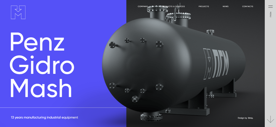
This entire website is an amazing example of design in itself. The loading screen is minimal but uses simple animation to give the effect of the entire site “loading” into the browser. It also introduces the brand’s main colour, their distinct shade of blue, as a feature colour for the site’s design.
2. Monsieur Noss
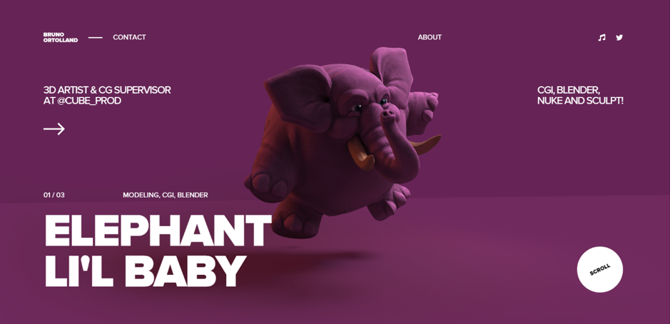
This website does something a little different with its loading screen. As an online portfolio for a 3D artist why not use the loading screen to list your skills? The minimal loading screen is purely text but adds music as a way to keep the site visitors interest peeked. While the music on a website can evoke memories of our old Myspace profiles, when used correctly it can be an effective tool (obviously we recommend you view the site with headphones on).
3. Zizo Festival
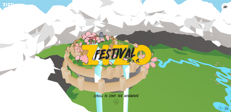
The loading screen for this site immediately sets the tone. There’s not one but two loading screens however both are vastly different. While the site itself uses a LOT of memory to run the loading screens are smooth and the bright colourful chibi characters in the second loading screen evoke a sense of fun.
So there you have it. We hope you’ve gained a better understanding of the pro’s and con’s of loading screens and, if you are going to have one on your site, you now know how to do it well. If you can think of any sites you either love or loathe don’t hesitate to let us know.
